
Course Detail: CMP502 - Excel®: Visualizing Data with Charts
 Interpret your Excel® data and organize it to create visually appealing charts and graphs.
Excel®: Visualizing Data with Charts focuses on helping you turn data into clear, useful visuals that support better understanding and decision-making. This course shows you how to use Excel's charting tools to answer questions, highlight key trends, and share insights effectively across teams and departments.
You'll learn how to create and format charts that present information clearly, along with more advanced features that allow you to analyze and compare data in meaningful ways. By the end of the course, you'll be able to communicate data-driven insights with confidence using well-designed charts.
Course Highlights Include:
- Creating and inserting charts
- Modifying and formatting charts
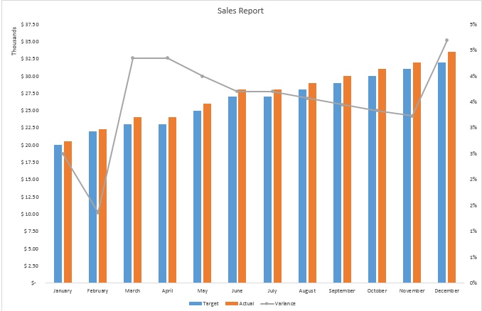
- Using advanced chart features such as forecasting, trendlines, dual-axis charts, and chart templates
Prerequisite: Basic knowledge of Excel®.
About the Instructor
|